

Q6 Spin Out With Excel
Introduction
The Superb Slushie Company wants your help! You've discovered something very interesting; no matter what color your Slushie is, there is only one flavor. The store has an interesting advertising approach (which is why you go there): the customer spins a spinner when they order, and that determines the color of the Slushie they get. The owner happened to notice one day that he was running out of the Red color additive. He wondered if they needed to order more of the Red in his next order. You asked how many they sell in one day, and also in one month so that you can make a recommendation. You decide to do an experiment and graph the results before making your recommendation.
I Can Statements
- analyze data and create a visual representation of it
- use spreadsheets, charts and visual representations as tools to help organize, evaluate, and present data
Key Vocabulary
Sum: The sum is the function of adding cells in a spreadsheet. (=sum)
Probability: Probability is a number between zero and one that shows how likely a certain event is to occur.
Vocabulary Game
Play the interactive Quizlet Game: Direct Link
steps:
Microsoft Excel:
1. Start by downloading this Microsoft Excel Spreadsheet. 13.Q6. Excel Spinner Template.xlsx
- When you download the Excel file note where it was saved (Downloads folder perhaps)
- If you are using the ONLINE Microsoft OneDrive and Excel application, then log into your account. Then download the file, and in OneDrive use the Upload>A File to upload the spreadsheet.
- If you are using the desktop app, then download and save the spreadsheet file to your Downloads or a location you select, then navigate to your downloaded Excel file and select it to open it on your computer.
- This Spreadsheet provided has several worksheets shown as tabs along the bottom. The first tab has basic information, the second one is for you to input the data from your experiments, and the third one is for your charts or graphs and an analysis of your results.
2. If possible, work with a partner (or small group). If you uploaded it to OneDrive, you will need to Share the file with your partners. If you are doing this on your own, you will take on the different roles.
- Spreadsheet Operator: Open the spreadsheet and remember to SHARE IT with your partner or group.
- Spinner Operator: Will run the interactive spinner and call out the results.
- Analyst: Read the directions for each step and then reflect on the results and analyze the data, with your partners or on your own.
3. The Spinner Operator will go to thisinteractive spinner to simulate the 5 Slushie colors used by the Superb Slushie Company. The Spreadsheet Operator will record the data into the spreadsheet template.
Note1: If you do not have a computer that can run this spinner, you could make a spinner by drawing a circle. it should be divided into five equal sections. Color the sections with: purple, yellow, blue, red, and Cyan (light blue). Attach a paperclip or other item in the center to spin, or use a dice.
Part 1 Spin and collect the data
Part 1 Collect data
1.1. Spinner Operator:
- Locate and set the Number of Sectors to 5 (one for each color).
- The owner told you he sells an average of 10 Slushies each hour on the weekend.
- Enter the number 10 in the Spins box.
- Click on "spin" button to carry out this Experiment to see the results for Round 1.
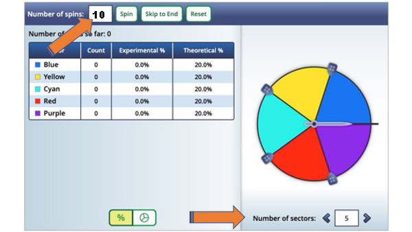
- Analyst: Look at the Column titled Theoretical %, why do you think they are all the same % at the start of this experiment?
- Notice the Count column on the spinner shows how many times the spinner landed on a particular color sector.
- It shows the Experimental % of your spin
- It also shows the Theoretical % for a single spin of a single color (or 1 out of 5 chances to get any one color)
- Are your results, experimental %'s, different than the theoretical ones?
- Why do you think they are different or the same?
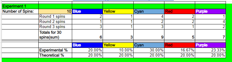
1.2 Spreadsheet Operator: Record the Round 1 results
- Record the results for Round 1 in the Experiment One section of the spreadsheet, (as called off by the spinner partner if working with one). An example is shown below.
- Remember to RESET the spinner after each Round of 10 spins.
- Continue to do Round 2 and Round 3, recording the results after your spins
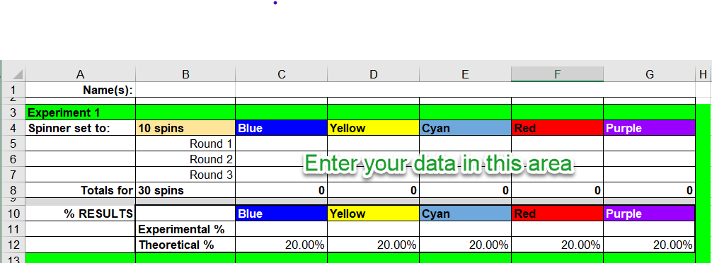
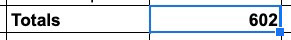
- Notice that the totals are automatically calculated for you using a formula. You will learn about formulas in the next part.
1.3 Experiment 2.
- The Slushie company owner told you that he sells approximately 900 each month.
- Repeat the experiment, but this time you choose the number of spins to set the spinner for (maximum is 1000 per spin).
- Type the number of spins you have decided to use in the spreadsheet for Experiment 2.
- Record the data after each of the 3 rounds of spins.
Reflection Questions:
- Look at your results from 30 spins in Experiment 1, and the results from your Experiment 2. What differences do you notice?
- What would you recommend if you only looked at your first set of spin data?
- Did the results of Experiment 2 change what you would recommend?
- Would doing another experiment with 3000 or more spins have a different result, and if so, what and why?
Real Life
- Watch for ads on TV, in posters, or social media that state things like, "90% of teens...", or "9 out of 10 users highly recommend...", or show 4 and 1/2 stars for a rating.
- Do statements or stars like these influence you?
- How many people do you think they polled, or who did they poll?
- Was it just their family, friends, or classmates?
Continue to the Formulas section below.
Part 2 Formulas
Part 2 Formulas
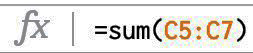
Your next step is to use a formula so the spreadsheet will add up the totals for you in the Totals row in Round 2. You can do this by using the SUM function below.
Example: The formula used for Experiment 1 in cell C8 to add Cells C5 + C6 + C7
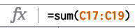
2.1 In the spreadsheet, in Experiment 2, put your cursor in the Totals Row under the Blue column (cell B20 in the example shown).
2.2 Using the spreadsheet provided for this activity, type this formula into the cell =sum(C17:C19)
- The = sign lets the spreadsheet know you want to enter a formula.
- The word sum will add up the cells you indicate
- The : (colon) between the cells indicates to add up everything between the first cell you select (C17), and the last cell (C19) selected.
Press enter and if you did it correctly you will see the total. It will let you know if you made an error and try to suggest a corrected formula or fix it automatically.
- When you are done, put your cursor back in the cell and see the formula appear on the formula bar above the spreadsheet.
2.3 POWER SHORTCUT: Filling the formula across to other cells in the row.
- Once you have successfully entered the formula, select the cell once more. Look closely for the large square in the lower right corner of the cell.
- When you put your cursor carefully over the corner square (it's called a fill handle) your mouse will become a large cross hair, click with your mouse and DRAG across to the right to the last column to total and let up on the mouse. It will fill the sum formula across to the others.
2.4 Calculating the Experimental % figures for your data
- For both of the Experiment 1 and Experiment 2 data sets there is a row for calculating the Experimental % of times the spinner landed on each color. You will be able to compare these figures with the Theoretical %.
- The challenge is to see how close or different your data is.
- Put your cursor in the Experiment 1: Experimental % cell under Blue (cell C11 in our example).
- To calculate this, you are going to create a formula to divide the total number of spins for each color by the total number of spins done in all three rounds (30). Try this formula =C8/30 (in cell C11).
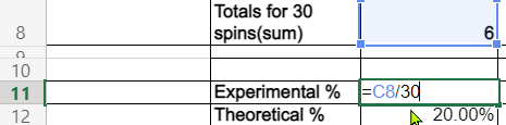
- Then use the fill handle technique and drag it across the other cells! How close are your Experimental percents to the Theoretical ones?
- Do the similar process for Experiment 2, but use the correct total of spins you used to divide by.
Challenge question: Which set of Experimental % results, were closer to the Theoretical % ones? Why?
Note on Part 3
Microsoft Excel through Office 365 Online does charts differently than the Excel Desktop App, so there are two different sets of directions below. Choose the one that you are using. The Desktop App does have some more options for than the online version.
Part 3 Charts with the Excel Desktop App
The Desktop app version of Microsoft Excel has some different options for charts and graphs.
Note: You will be creating a chart of the Experimental Results from your spins with the Theoretical spin results. Since we are using the spinner with 5 sections, the theoretical chance of landing on any one color is 1 out of 5, or 1/5=.20 or 20%.
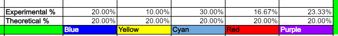
1. To help our chart data include the names of the color sectors, we will copy the colors from row 3 and paste them into the row above the Experimental % results, and do this for both Experiment 1 and 2. It should look something like this when you are done:
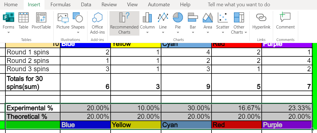
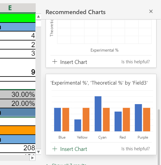
2. Select cells B10 over and down to G 12 for the chart.
3. Use the Insert menu and Recommended Charts from the menu bar.
Select the Clustered Column Chart for this example.
4. Change the Chart title by selecting it and typing Experiment 1: 30 spins.
5. Change the titles of Series1 and Series2 below the chart by clicking on the Chart, then Select Data. Edit the name of Series1 and change it to Experimental 30 spins and Series2 to Theoretical.
6. Select the entire chart (right-click or select copy from the chart menu), and click on the next sheet (tab on the bottom of the sheet) and paste it and resize it to fit.
7. Return to the Experiments sheet and delete the chart there, and now make a Chart for the Experiment 2 Experimental and Theoretical Section.
- Select the cells> Insert chart > Recommended Chart by selecting the clustered column chart.
- Change the title to Experiment 2 and the total number of spins you did in Experiment 2.
- Copy the chart and paste it onto the next sheet with the other chart.
8. Look at the two charts for any differences:
- Look at the vertical axes and the %ages showing for each.
- If these are different then the charts will be skewed.
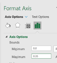
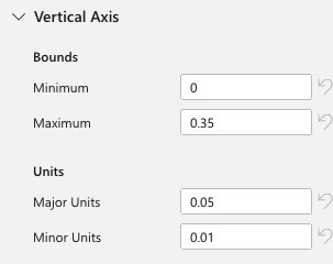
- Notice the first chart goes from 0% up to 35%
- To fix this on the 2nd chart double-click on the main chart to see the Format Chart Area.
- Use the Chart Options drop-down menu and select Vertical (Value Axis)
- Select the column bar icon to see the Axis Options. Open that menu to see the Bounds boxes where you can enter the Minimum and Maximum for your vertical axis. Enter zero for the Minimum and .35 for the Maximum.
9. Now when you look at the two charts write up a short recommendation you would make based on only the results from Experiment 1 and then write one based on the results from Experiment2, Explain which results you feel are a more accurate prediction for the Slushie company when they prepare to make their next order of color additives.
Part 3 Charts with Excel Online
Excel ONLINE directions for Charts
- Have your graph open in your online account and select across the names of the colors for the slushies (Blue, C4 and drag over to Purple, G4)
- Copy (ctrl-c) and then put your mouse in cell 13 and paste it (ctrl-v). It should look like this after you paste it.
- Next, select the cells to use for the graph B11 through G13. With them selected, use the Insert menu and locate the charts. Select the Insert Recommended option.
- Scroll down through the charts shown on the right until you find a bar chart with the two bars (experimental and theoretical) next to each other and click on insert.
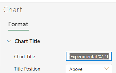
- The next step is to edit the title above the chart.
- With the chart selected (click on it once) and do a right-click to select format.
This will open the Format chart section on the right side.
Expand the Chart Title section and delete the text and replace it with a better title (such as Experiment 1, 30 spins).
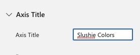
- Scroll down further to the Horizontal Axis, and change the Axis title to Slushie colors.
- Go down to the Vertical Axis, and note the Bounds and Units so you can set the next bar chart up with the same settings.
- Select the bar chart once again and copy it (ctrl-C or right-click copy).
- Add a new sheet (use the small plus at the bottom).
- Paste the chart onto the new sheet, moving it to the top left side to leave room for the Experiment 2 chart.
- Repeat these steps to create a chart for Experiment 2, using the data in the cells B23 to G23.
- Change the Titles for the Horizontal and Vertical Axis
- Copy and paste it onto the new sheet you added earlier, move it next to the Experiment 1 Chart. Does anything look different about the axis?
- Be sure to format the chart again, and adjust the settings for the vertical axis (bounds and units) to be the same as in Experiment 1 Chart (shown in step 8 above).
- Analyze your results and make two recommendations
- Based on the results of Experiment 1, I/we would recommend purchasing more of the ______ color additive based on our experiment of spinning it 30 times.
- Based on the results of Experiment 2 ......
- If the axis were set to different units on one of the charts how different would it look? This is one way that data can be misleading unless you dig in carefully.
Part 4 Advanced Probability Challenge (Optional)
Part 4 Advanced Probability Challenge
One of your friends challenged you with a tricky question, "How many times would you have to order to get one of each color?"
You decided to figure it out!
Resources:
- Introduction to Probability - Math is Fun
- Probability Event Types - Math is Fun
- What is the probability of spinning all of ONE color 5 times in a row?
- What would the probability be to spin a random color 5 times in a row?
You may find using a probability tree diagram (example started below).
Resource: Probability Tree Diagrams Math - is - Fun
BGROY
BGRYO
BGYRO
BGYOR
BGORY
BGOYR
BYGRO
BYGOR
BYRGO
BYROG
BYOGR
BYORG
and so on for the other branches in the probability tree. There are 6x5 possibilities.
What is the probability of spinning one of each color?
Think of a 5x5 Punnet Square with 5 dimensions instead of 2. Whew!
Completing this Quest
- Save your spreadsheet and Spinner report document.
- Prepare a short (no more than two minutes) presentation about something you learned from your Spinner Project.
- Identify what you want your audience to know at the end of your presentation.
- You should use some of the screenshots you took for illustration in your presentation.
- You might pose an interesting question or problem to your class in your presentation.
- Try to engage your audience.
- Check with your teacher and use multimedia resources you learned about in other quests. Make this a fun but educational Report Out.
- Check with your teacher on how they want you to turn it in or share it with them.
Check off this Quest on the 21t4s roadmap if it is used in class.
I am ready to go on to Quest 7,


Competencies & Standards
MITECS Michigan Integrated Technology Competencies for Students, and
5. Computational Thinker
b. Collect data or identify relevant data sets
6. Creative Communicator
c. Communicate complex ideas clearly and effectively by creating or using a variety of digital objects such as visualizations, models or simulations
d. Publish or present content that customizes the message and medium for a variety of audiences
Websites and Documents
Websites
- Interactive Spinner
- Introduction to Probability - Math is Fun
- Probability Event Types - Math is Fun
- Probability Tree Diagrams - Math is Fun
21t4s Videos
- Spin Out Animated Intro Video
- Excel Charts and Graphs Video
- Part 3 Excel Online Charts Video
- Part 3 Excel App Charts Video
21t4s Documents & Quizzes